Insights20/08/2026
From creative concept to campaign rollout
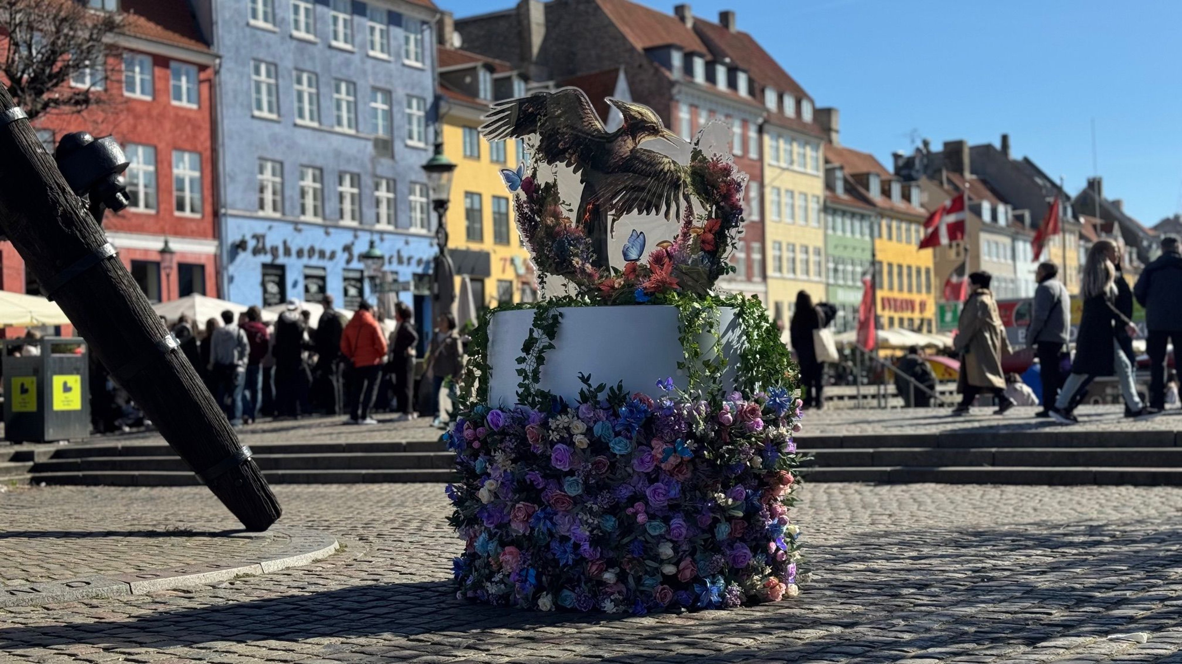
For the trailer launch of The Hunger Games: Sunrise on the Reaping, we were excited to support Lionsgate with the rollout of a series of striking floral installations.
Insights
2 juillet 2024
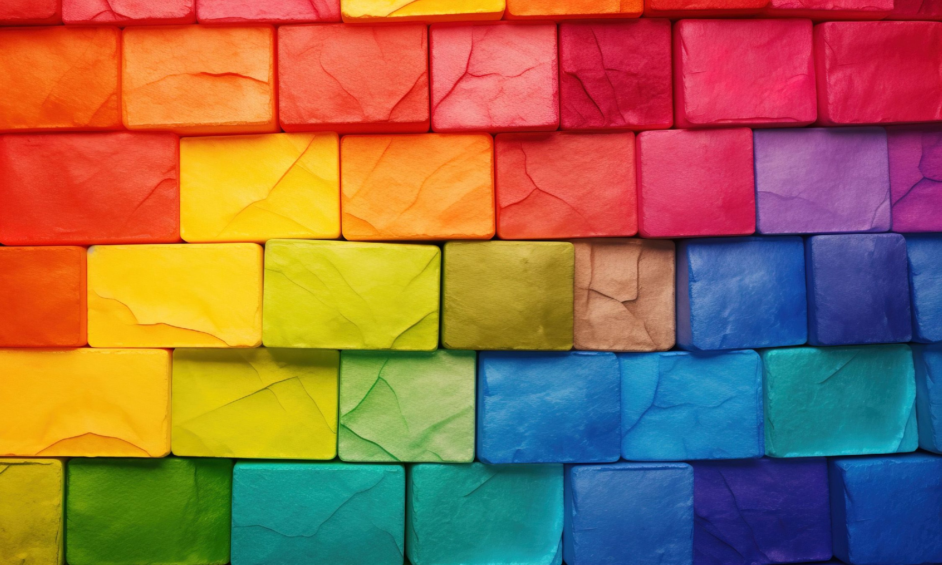
In visual marketing, colour is a powerful tool that evokes emotions, conveys messages, and influences consumer behavior. However, its meanings can vary across cultures and should be considered when creating global campaigns. We have put together some of the key differences and tips for using colour effectively!
In the world of visual marketing, colour is more than just a design element—it’s a powerful tool that can evoke emotions, convey messages, and influence consumer behaviour. However, many of the meanings associated with colours are not universal – they vary significantly across cultures and need to be taken into account when creating marketing campaigns that aim to resonate with different target groups.
We have collated some of the more prevalent differences in this blog, as well as some tips on how to apply colour in your global marketing campaigns as a short introduction into the exciting world of colour!
Red: In Western cultures, red is often associated with excitement, love, and danger. It’s used to grab attention and evoke strong emotions. However, in many Asian cultures, red symbolizes prosperity, happiness, and good fortune. It’s a colour commonly seen in celebrations and weddings. For example, in China, red envelopes containing money are given during festivals and special occasions to symbolize good luck.
Blue: Blue is widely seen as a colour of trust and reliability in Western countries, making it a popular choice for corporate branding and financial institutions, though it also has some associations with melancholy and sadness. In contrast, in some Middle Eastern cultures, blue can be seen as a protective colour to ward off evil. And in other cultures, such as in parts of Central and South America, blue can be associated with mourning.
Green: While green tends to represent nature and environmentalism in most parts of the world, its cultural connotations can vary. In the United States and many Western countries, green also signifies wealth and stability, whereas in Indonesia, green can be a forbidden colour, especially in certain traditional contexts. In some Middle Eastern cultures, green holds significant religious meaning and is considered sacred in Islam.
Yellow: In many African and Latin American cultures, yellow represents wealth due to its close resemblance to gold, while in Egypt, it can be associated with mourning. In many Western cultures on the other hand, yellow is often associated with happiness, energy, and optimism in many Western cultures. It’s a colour that grabs attention, which is why it’s used for warning signs and traffic signals. However, it can also have some negative connotations such as jealousy and betrayal.
Black: In Western cultures, black is a colour of sophistication and elegance, often used in fashion and luxury brands. It’s also a colour of mourning and solemnity, commonly worn at funerals. In contrast, in some African cultures, black can be associated with masculinity, maturity, and leadership, while in the Middle East, it represents both rebirth and mourning.
White: In many Eastern cultures, white is the colour of mourning and funerals. For example, in China and India, white garments are traditionally worn to honour the deceased, symbolizing the cycle of life and death. However, in Western cultures white is commonly associated with purity, cleanliness, and simplicity, often used in weddings and healthcare branding.
For global brands, understanding these cultural nuances is vital for creating visually appealing and culturally resonant marketing campaigns. Here are a few tips for leveraging colour in global marketing:
Colour is a powerful element in visual marketing, capable of conveying complex messages and evoking strong emotions. But by understanding and respecting that its meaning can vary widely across cultures, you will be able to create more effective and resonant campaigns that connect with your local audiences on a deeper level.
At ARIAN, we have over 50 years’ experience in producing POS materials for companies and brands all over the world, and we are committed to using our expertise gained through this to help you navigate these complexities and leverage the power of colour to elevate your global marketing efforts.
For the trailer launch of The Hunger Games: Sunrise on the Reaping, we were excited to support Lionsgate with the rollout of a series of striking floral installations.

Your sales materials serve as your brand’s voice, communicating your message to your chosen markets. We share how adding the ‘personal touch’ across our services can elevate your marketing materials and ensure your message resonates exactly as intended

Welcome to our blog series, where we want to explore the advantages of some traditional as well as alternative materials in point of sale printing. Our first material is cardboard honeycomb board.